Stephen Jones at the Arnhem Mode Biennale
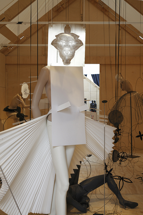
Stephen Jones’ installation. Photo by Kevin Deux.
This summer, the town center of Arnhem, Netherlands, was invaded by nine newly constructed wooden pavilions or oversized birdhouses on five-meter-high stilts, perched only slightly less precariously than some of this seasons shoes, barely balancing on their steel heels. In the midst of every other European Art Fair, June’s month-long Arnhem Mode Biennale, curated by Artistic Director and renowned illustrator Piet Paris is a public fashion event geared toward both the professional and the public. The first exhibit was housed within this series of Dover Street-like reusable wooden huts, raised like urban tree-houses on scaffolding. A narrow bridge and the pavilions themselves, lead to and through the centuries-old Eusebius church and the post-war city hall; the location of the second part of the event.
Now in its third edition, the theme of this year’s Biennale was SHAPE, and determined to examine the diversity of craft and technique in the work of its 48 invited exhibitors. And they reeled in as evidence some of the best silhouette-makers, international fashion designers such as Comme des Garcons, Lanvin, Hussein Chalayan, Calvin Klein, Jil Sander, Martin Margiela, Rick Owens, Boudicca and milliner Stephen Jones; for relative newcomers they had Thom Browne, Rodarte, Christopher Kane and Sandra Buckland. The spectacular Dutch duo Victor&Rolf presented their ode to shape in the form of a hologram. Local talent like Klavers van Engelen and Spijker &Spijkers were exhibited democratically alongside recent St Martins and ArtEZ (Arnhem’s renowned art and fashion academy) graduates, Matttijs and Iris van Herpen. While some concepts were illustrated graphic or photographically on wooden trestle tables, authentic-looking wax mannequins, were used to underline the direct link between shape and 3-D. (LEFT. FROM THE MARGIELA EXHIBITION. PHOTO BY KEVIN DEUX)
I took a few moments to chat directly with some of the show’s participants and creative talent.
Milliner extraordinaire, Stephen Jones on his hothouse of ideas:
HAIDEE FINDLAY LEVIN: Glasses are for me what hats are for you: I never leave the house without them. But can you wear them both at once?
STEPHEN JONES: You certainly can. Something that’s upturned in front works best; otherwise your face recedes into the background.
HFL: Is there a case of overkill, especially around the face? Is less more? Is there ever too much?
SJ:I love what Morris Lapidus, the architect of the Fontainebleau Hotel in Miami said:
‘Too much is never enough!’ I was working on a window display with John Galliano before the opening of his store, and the window dresser said: Before you go out the door, always take one thing off! “And John’s response was: In the world of Galliano it’s the opposite; we always add one thing on!” I subscribe to both views.
HFL: I think Italian Vogue‘s Anna Piaggi, one of your biggest supporters, subscribes to Galliano’s point of view. But which is more chic?
SJ: People should move from restrain to excess, chic is different from one to another.
I do believe in self-expression.
HFL: Do you have a muse?
SJ: It would be too dangerous to have one person to inspire me.
HFL: Is there a perfect face for a hat?
SJ: A strong jaw-line and a long neck certainly help.
HFL: Does this apply to both men and women?
SJ: Yes, but it’s really a question of balance, and whether your face is strong or soft. (RIGHT: FROM BOUDICCA. PHOTO BY ERNST MORITZ)
HFL: What about different hats for different occasions? What is really appropriate if you believe in self-expression?
SJ: Of course there are some that work best for work, others for dinner and something else for going to the races, such as Royal Ascot. [The British Royal horse race show, and greatest horserace show in the world, dating back almost 300 years] But I’m an old punk at heart—so I do love the idea of seeing a baseball cap at Ascot!
HFL: For this show everyone else exhibited in a wooden house. Yours is in glass. Why?
SJ: Piet told us about these wooden houses, but it bothered me that you couldn’t see out—I thought of a glass house, like a hot house. This seemed appropriate for Holland with all its green or hothouses. The theme was about shape, but all hats are about shape anyway. The greenhouse idea led me to the idea of hats being as diverse in shape as flowers-so I chose hats with a floral or vegetable theme, and created a glass hothouse full of them!

