A Visual History of L.A.’s Greatest Rock-n-Roll Billboards
A bottle blonde, her face largely obscured by sunglasses, cruises with the top down past the palm trees and billboards of Sunset Boulevard—it’s an indelible image. As a teenager growing up above Tower Records, just off the Strip, Robert Landau witnessed it often, and it occurred to him that the larger-than-life ads dotting America’s most storied street would ultimately disappear. And so he began photographing the marching Beatles and smoldering Springsteens—and, well, whatever Cher was doing—that loomed large over Los Angeles from the late 1960s to the early ’80s, at the height of rock-n-roll. Landau’s pictures—the subject of both a book, Rock ’n’ Roll Billboards of the Sunset Strip, and an upcoming documentary, Sign O’ the Times—appear less like a compilation of snapshots and more like a stream of consciousness that flows directly from the American id. Here, the photographer shares a few of his favorites.
———
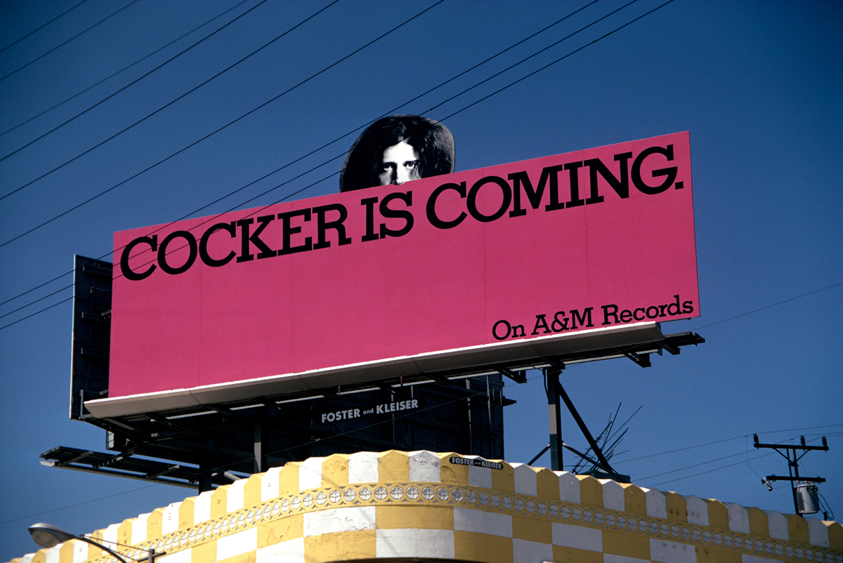
Joe Cocker, “Cocker Is Coming,” 1969
“This is just such an eye-catching bit of graphic art, with his head sticking out. This period of billboards started around ’67 with The Doors. Jac Holzman, the founder of Elektra Records, is credited with being the first one to put a rock-n-roll group on the Sunset Strip. It lasted until the launch of MTV in the early ’80s, when all the money that was being put into billboards got siphoned off to make music videos. It really was an art form of the ’70s.”
———
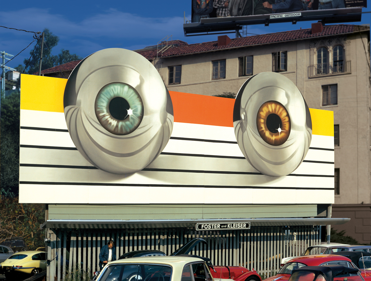
The Who, Tommy, 1972
“This is one of my favorites. It’s based on The Who’s rock opera Tommy, about a blind, deaf, and mute pinball wizard. These billboards weren’t very commercial, considering it was a commercial medium. In many cases, there was no text telling you what it was even selling. Maybe only a few people understood that those eyeballs represented chrome pinballs with eyes.”
———
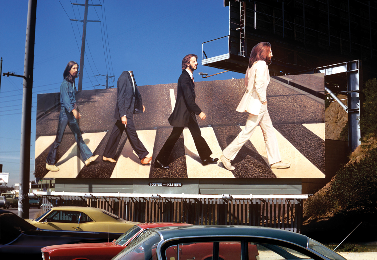
The Beatles, Abbey Road, 1969
“This album cover, designed in England by John Kosh, was sent over to Capitol Records, and they didn’t really get The Beatles at that time. They thought it was like the hula hoop—a fad that was going to pass, so they gave the job to Roland Young, the youngest designer there. He went to the site where the billboard was and figured out that the sky was the most interesting part of the location. He designed the billboard so that the heads of each Beatle would extend above the top of the frame and pop out against the sky. At that time, there were a lot of rumors going around that Paul McCartney had died. People were playing the record in reverse, looking for clues, and they had ascribed the imagery of Abbey Road to it. They thought that since Paul was barefoot in the picture, that this was a funeral march. At the height of this frenzy, some kids got up on the billboard and cut his head off. The label called Roland Young and said, ‘Hey, somebody took Paul’s head. Do you want us to replace it?’ He drove out there to look at it and said, ‘You know, just leave it alone. It’ll get a lot more attention like this.’”
———
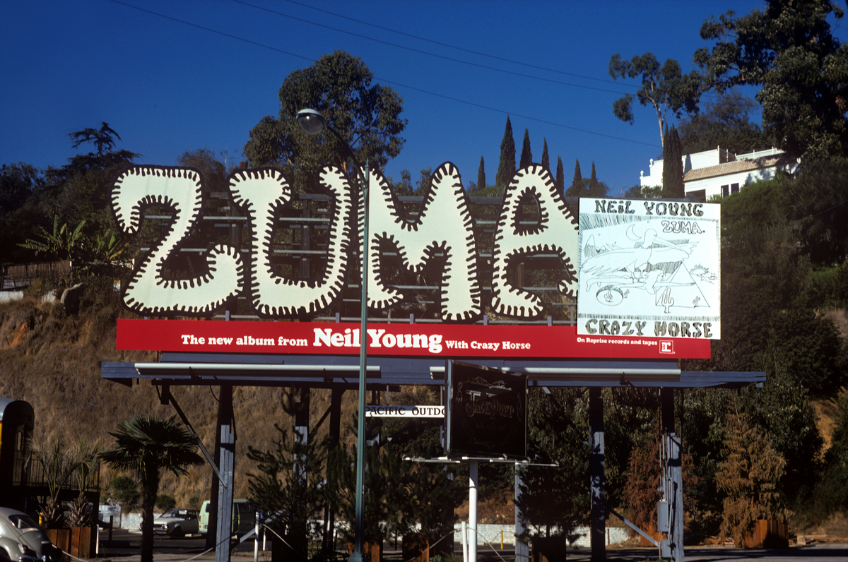
Neil Young, Zuma, 1975
“Zuma was one of my favorite records at the time. Not that many people saw these billboards and it was hard to prove it had anything to do with selling records, but the managers and a lot of the company people had their offices on the Strip, so it meant a lot to the stars. If Neil Young was coming in to see his manager, he could see his billboard on the Sunset Strip, and it was a bit of an ego thing. They were speaking to themselves and to other people in the business more than anything else.”
———
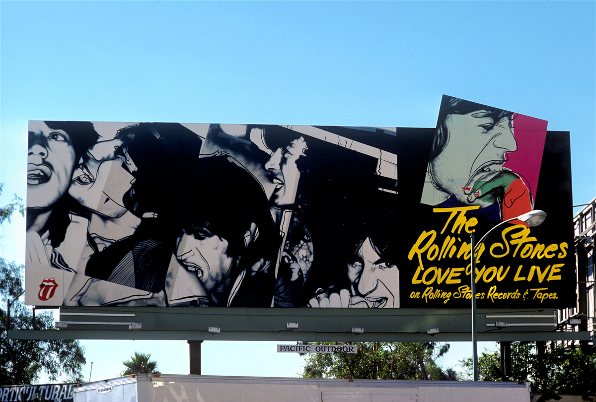
The Rolling Stones, Love You Live, 1977
“This is an Andy Warhol design based on an album cover that he did for The Rolling Stones. Warhol obviously crossed into the commercial world a lot, but there were other cases where fine artists had designed album covers. I think there is a Talking Heads cover designed by Robert Rauschenberg [Speaking in Tongues, 1983]. In that period, there was a group of artists who actually painted on stitched canvas that was then wrapped over the billboards, and Ed Ruscha was one of them. He did a painting called The Back of Hollywood [1977], which showed the Hollywood sign from behind. I think he ended up cutting it up and making it into a tent in the desert.”
———
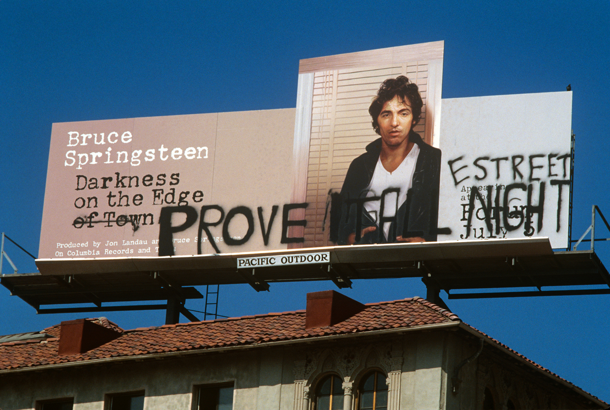
Bruce Springsteen, “Prove It All Night,” 1978
“It’s 1978, and Bruce Springsteen is in town doing a series of concerts. He drove over to the Strip to see his billboard, and he hated it. At his concert the next day, he talked to the people in the crowd and said, ‘Hey, go up on the Strip and see the billboard. My nose is too big,’ or something. So they went and climbed up on the building that it was on with a bunch of spray paint. Bruce was on [the E Street Band’s saxophonist] Clarence Clemons’s shoulder, trying to paint a mustache on himself. But he couldn’t reach that high, so he settled for writing ‘Prove it all night.’”
———
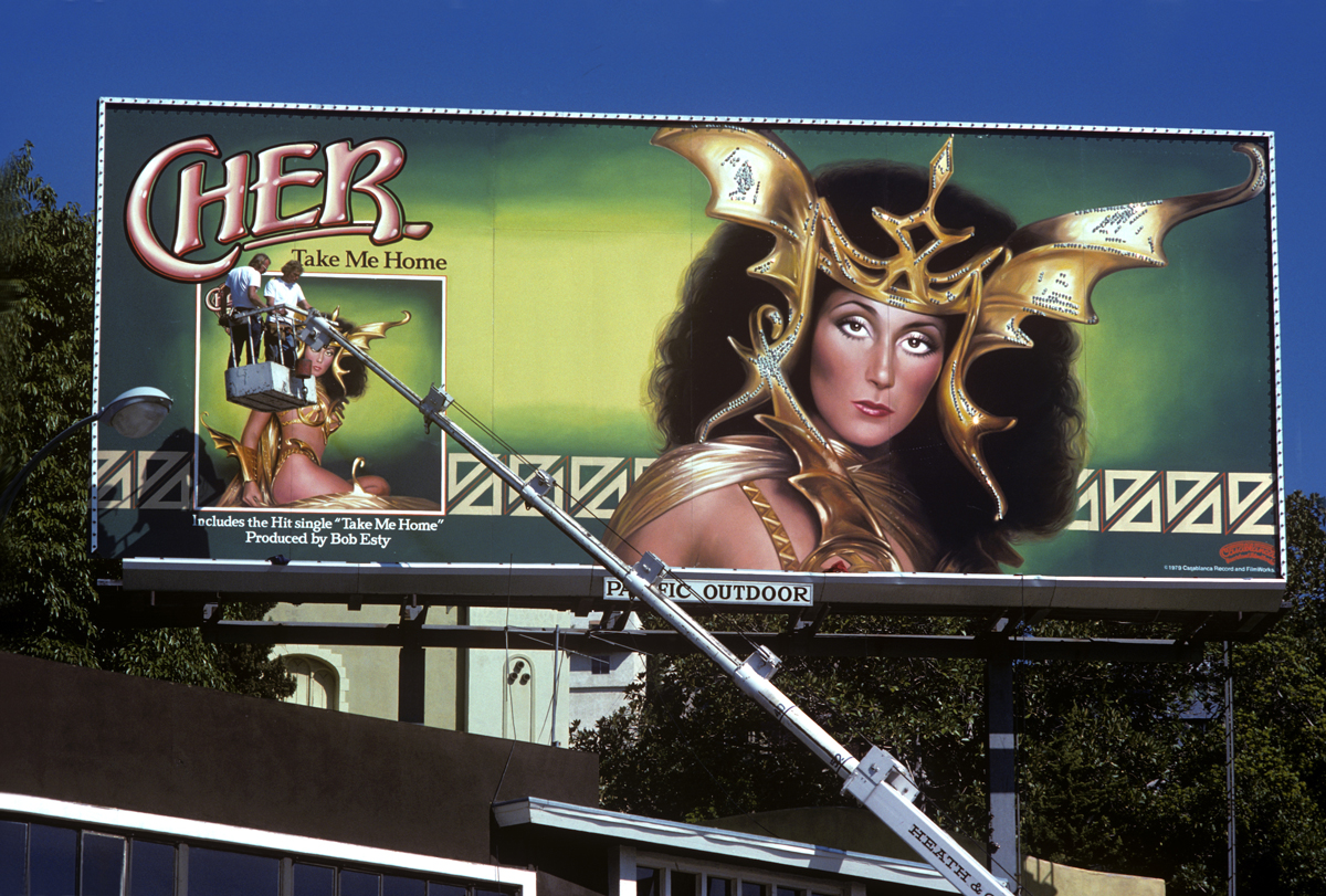
Cher, Take Me Home, 1979
“By the end of the ’70s everybody in the music business, not just the classic rockers, wanted a billboard. When the rock billboards started going up, they replaced the lounge lizard generation of Sinatra and Sammy Davis Jr. But then it came back to this entertainment theme, where people put on funny costumes just to get your attention. It lost some of its teeth toward the end. Cher had on some kind of crazy butterfly thing that probably had sequins on it that shone in the sun and caught your eye. At first I thought it was bat wings.”
———
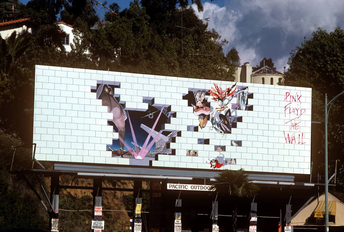
Pink Floyd, The Wall, 1979
“When this billboard first went up, no one knew what it was. It was all bricks. They left it up there like that for a while, and then, little by little, they started peeling off some of the bricks, and there was a design underneath. It was kind of an interactive billboard. The design was based on the album sleeve. It was what they call a gatefold album—when you opened the album, you saw a design by Gerald Scarfe, who had created these sort of cartoons based on the characters that are talked about in the record. It’s about mothers, schoolteachers, and a kid named Pink.”

