art!
At Design Miami, Harry Nuriev Takes It to the Bedroom

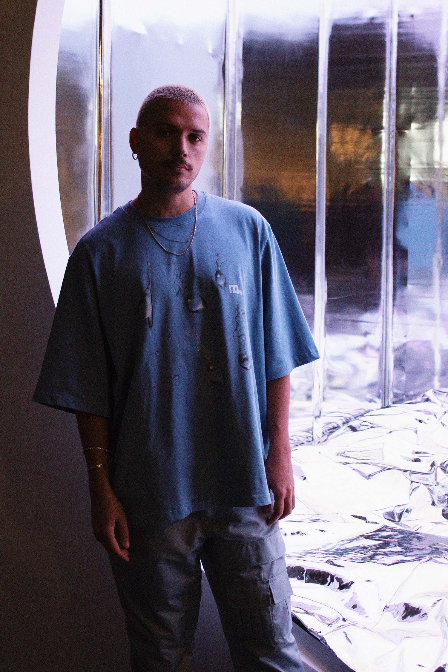
Photography by Paige Silveria.
Upon entering Design Miami’s sprawling exhibition tent, visitors are immediately confronted with the alluring glow of “The Bedroom,” the latest brainchild of design-world darling Harry Nuriev. Housed in a cube-shaped alcove, the installation quivers with an ethereal, otherworldly glow—courtesy of the reflective vinyl that sheaths every visible surface—but the real centerpiece is the large bed that fills the enclosure. “The Bedroom” marks a logical progression in Nuriev’s work: among the Moscow-born designer’s hallmarks is a commitment to a single color for each new project he undertakes. Take, for example, the cobalt blue interiors of the newly-opened Crosby Studios Café in Paris’ Dover Street Market, or the all-chrome trappings of “The Elevator,” a furniture exhibition that debuted in Switzerland this fall.
Given the boundary-rupturing nature of Nuriev’s designs, it may be surprising to learn that the artist—who studied architecture and interior design—grew up in an environment that valued tradition above all else. But if anything, Nuriev feels that his intimacy with time-honored design mores has strengthened his knack for subverting them, creating an aesthetic language that lures in Design Miami visitors like moths to a flame. To mark the opening of “The Bedroom,” Nuriev sat down with Interview in the middle of “The Bedroom” to discuss interior design’s new vanguard, the symbolism of the bedroom, and why it never hurts to take a photo or two.
———
RACHEL SMALL: Where are you living these days?
HARRY NURIEV: I moved to Paris this summer. I’m so happy. We are happy to finally catch onto this new energy, new world, and new culture.
SMALL: “The Bedroom” had a predecessor, “The Elevator,” that you showed at Design Miami/Basel in Switzerland this past September. Was that the first time you made something in all silver?
NURIEV: Yes, that was the first time. I’m glad you’re asking about this material, because my work has a lot of different colors. I’m from very a traditional architecture school. And it’s an institutional credo not to use color in architecture. It’s gray, black, or white. Fshion and nature have so much fun color, and I always wanted to bring that spirit indoors. People don’t really do that. For some reason, we think that a neon green is not suited for interiors. So, I changed that. This year, I was thinking, “What’s the next color?” I didn’t really know, so I turned into silver, because silver is the ground zero of color. “The Bedroom” takes that to the next level—it’s reflective. The ceiling changes colors and refracts this beautiful landscape.
SMALL: It’s interesting that you compare the bed to a landscape. There’s a similar topography, especially when the bed is lived-in. Why are you so captivated by silver?
NURIEV: My favorite material is stainless steel. I translate that it into fabric, and this is what we have.

SMALL: I would never expect that you could lie down on something that looks like this and discover that it’s this comfortable.
NURIEV: It’s like my personality. People might think before they’ve talked with me that I could be conservative. But, I’m not. [Laughs] It’s the same thing with design—you look at a cold, silver thing, and you think, “Oh, it’s uncomfortable. And then you touch it and you find that actually, it is comfortable. It’s all about pushing boundaries and playing with your expectations.
SMALL: How did you give the surface this kind of buoyancy?
NURIEV: It’s a traditional comforter and pillow, with a mattress underneath. You can really sleep here. You know when you had sleepovers with your friends as a kid, and made crazy forts by draping blankets all over the room? That’s what I’m going for. My work is about my memories from childhood, and my desire to project those into the future. I call it retro-futuristic.
SMALL: What made you go from “The Elevator,” which was like a living room, to a bedroom?
NURIEV: When you think about an elevator, you don’t think of it as a room. People think it’s just some transitional space, but it’s a room that moves up and down. A bedroom is the space where we feel the most comfortable, and it’s the closest representation of who we are. We don’t have to hide anything. I think it’s an important subject, and I want to talk about it here.
SMALL: I was curious about your opinion on connecting fashion and interior design. How has your approach gone against the grain, and what kind of revelations have you arrived at in exploring this boundary?
NURIEV: In architecture school, you’re taught to find inspiration in other architecture, interior design, or sometimes art. I really tried hard to do that, and it never worked out. I was like, “Well, what’s my inspiration?” I really love fashion so it was a matter of exploring how I can translate a fashion obsession to interior design.
SMALL: How so?
NURIEV: For example, you can easily imagine, let’s say, high-heeled shoes in this material. I’m sure you have something similar in your closet.
SMALL: I definitely do.
NURIEV: But when you’re in a bedroom, and you see this material, that’s something new. So, that’s the shift. With this particular work, I was thinking about how I could use multiple colors in the same room, which I don’t usually do. I really like watercolor, but it’s too sentimental to bring to modern interior design. I was like, “What could be like a digital version of watercolor?” And I think this work represents how you can use five different colors in one room and still have it look minimal and clean. Which I love, because my work is very minimal.
SMALL: What do you think about all of these people who see “The Bedroom,” and instinctively take out their phone and take photos? What do you think is going through everyone’s minds?
NURIEV: I think it’s a good sign. I think it means they like it! It’s not that I’m encouraging or saying to people “You have to take photos,” or post to Instagram. I just do things that people want to remember, and take pictures of. I don’t think that hurts.


